Friday 20 May 2011

individual evaluation

My jobs were to create the images for the entire product and creating the body. I feel that the most important and most difficult aspect of my roles was creating the hands. I wanted to create a character that kept the youthful cartoony style whilst being realistic enough to learn from. The realistic proportions where necessary for an accurate animation of sign language. I feel I successfully achieved this and the animations are clear and can be learned from.
Rigging the mesh was difficult as it is not something I particularly enjoy doing.  The hands where rigged quite successfully in the end however there are some issues around the arms and armpits. If I were to recreate the torso I would rig it to a better standard to aid in smooth realistic motion.
The drawings and layout were also an important part of the overall look and style of the product. I feel that our aim was met to make a stylised product aimed at young children. I am pleased with the drawings that I created for each page and feel the buttons represent the words accurately.

product testing

A little after the work in progress phase of the product creation we had sufficient renders and functionality of the product to test it on a young deaf child. I took the product to my young cousin, age 5. I wanted to stay out of the testing as much as possible so I briefed his mother on the product and let her help my cousin start. He seemed to grasp the concept of the product and was interacting with it fairly easily. General comments that arose were
 The texture of the black character didn’t look appropriate as it had a green tint
We retextured the Black character and test rendered it until it looked accurate.
  The writing was difficult to read against the background
We assessed the colour of the writing and background and added an outline around the edge of the writing so it stands out more
 The Test section was difficult to understand as it wasn’t clear what the question was or whether the answer was correct
We created a correct and wrong symbol to be enforced on the page of the appropriate frame for the answer. Also we enlarged the Question and kept it as basic as we could.
This was helpful as changes such as these are fundamental for creating an engaging product. Colour schemes and writing are important to get correct.  We received positive feedback on the animation and was told it was easy to repeat.

Product testing Online
Left is a screenshot of our product testing on CG COACH.COM
We received feedback on the animation at an early stage. He mentioned that the movement looked mechanical and we should study from more reference.
We used this advice and began to video ourselves acting out the sign language. This proved useful
we also emailed a few places to get feedback on our product. These places included Headingley primary school. And coHEARent VISON which is a an organisation in leeds that helps the deaf and the blind.
Below is an image of a message that kept appearing when we tried to view our online .swf file. This is a website that would allow feedback on functionality. Unfortunately attempts to rectify this did not work and we unable to get this feedback.
We showed our peers our progression at several stages and each time we got feedback it helped us improve the project.
 This was most noted in functionality and animation. We got feedback on the way our renders moved whether it was positive or negative.
 The functionality was questioned when project pages were in orders that did not make sense to the user. This directly helped us improve functionality and simplify confusing busy pages

From looking at the Gantt chart showing our group progress on this current project, you can see that we are on track with our project and are confident that we will have a professional product by the deadline presented
Groups
As a group, we feel that this product displays a broad range of skills, both technically and creatively. Working in this group has allowed us to experiment with various different ideas, technical processes and software. We feel that we have been a good group in the way that we have shared the workload equally. By dividing up the tasks and processes early on, both of us knew what was expected of us, and by what deadline. Occasionally, we would swap files using Facebook and Hotmail to help each other out. We are both under the impression that constant communication is essential to working well as a group, so that ideas can be shared, and each member of the group receives regular updates about the product and its current stages. Outside of university, we are good friends, which meant that our regular Facebook chat sessions could be utilised for our project. We are both comfortable with the idea of working with each other again on future projects, should the opportunity arise, as we both have similar tastes and styles with regards to our animation, and also our social lives

product testing

Product testing Online
Left is a screenshot of our product testing on CG COACH.COM
We received feedback on the animation at an early stage. He mentioned that the movement looked mechanical and we should study from more reference.
We used this advice and began to video ourselves acting out the sign language. This proved useful
we also emailed a few places to get feedback on our product. These places included Headingley primary school. And coHEARent VISON which is a an organisation in leeds that helps the deaf and the blind.
Below is an image of a message that kept appearing when we tried to view our online .swf file. This is a website that would allow feedback on functionality. Unfortunately attempts to rectify this did not work and we unable to get this feedback.

We showed our peers our progression at several stages and each time we got feedback it helped us improve the project.
 This was most noted in functionality and animation. We got feedback on the way our renders moved whether it was positive or negative.
 The functionality was questioned when project pages were in orders that did not make sense to the user. This directly helped us improve functionality and simplify confusing busy pages

product evaluation

Product Evaluation
We are very pleased with the outcome of our project, and feel that we have designed and created a product which could be very beneficial to young deaf and hard of hearing children to improve their communication skills.
The product contains a broad range of high quality images, with little repetition, keeping the user entertained throughout the product. The Animation accurately represents the individual Sign language based on our research and reference.

We are happy that we got a test feature which allows users to challenge themselves and find out how much they have learnt from the product. Although the test features only one question for each category, the functionality shows that more questions and categories could be created for a larger product.
We completed everything we set out to do and feel we met our aims and objectives successfully.

What would we do different:
If we were to carry on with this project there would be several changes and additions that we would make to improve the quality and fun within the product. In no particular order we would:
·         Create a customize section where by you can interchange colour scheme’s within the overall layout.  And also change and create viewport backgrounds. This makes the experience more personal to the user.
·         Create a female signing avatar so it is more gender friendly. Perhaps with a lot more time an area could be developed were you customize your own characters similarly to a Mii character on the Wii console.
·         I would rig the model better around the arms as there is some mesh distortion around the armpit regions during specific movements as mentioned within evaluation
·         Add more categories for the basics of sign language. Categories would include subjects such as colours, household items, questions, numbers and time.
·         Make the Test section larger by adding a “sentence build” section.
·         Add extra morph targets such as smile, sad and surprised  expressions
·         Animate the sign language that represents the introducing paragraph.
·         Spend more time sculpting the face to create more definition within the nose and ears bringing the character to life.
·         Create a score page at the end of the test section that calculates how many questions were wrong and right. Getting a score gives the user a reason to beat it and do better.

Thursday 19 May 2011

Video references

References.
Because of my own style of animating and professional online critique I took it upon myself to act out the signs so I can watch the videos back and animate the movement accurately. I slowed the sign down and broke the movement slightly so that it appeared as though I was teaching someone as oppose to quick casual conversation where you could miss the technique all together. This shows in my animations.

chicken

chicken close

dog

cat

cat

cat

Wednesday 18 May 2011

Rendering


Animating
When animating I had to analyse the movement of my references. I had acted out each sign in a manner that breaks the sign down to show viewers how it’s made. I also had to create an angle that best shows the movement of the sign from a closer perspective.


Materials
Because of the schedule, I animated every sign before I had time to properly texture the models it was this reason why we had to individually change the values of each colour in each 3DS Max file to be the same as my original ‘final scene’. We used an ‘architectural’ mode – choice fabric to create the t-shirt material and the skin was basic with added Specular (10) to shine off knuckles and such to emphasise movement, we also used a ‘double side’ colour mode for the face and ‘multi-sub’ for the eyes.


Render
I rendered the scene out using scan line render and set up the cameras in a fashion that best shows the animated sign. I rendered it out at .mov format so it can be easily imported into after effects.


Lighting
I had to setup the lighting and decide to use the three point lighting system. This was because it makes the character look better and creates shadows. The back light was a direct light that creates a rim around the edge of the character. The two in front are at an angle; one is stronger than the other. This is because it creates a better shadow effect and doesn’t drown out the colour of the scene

Monday 16 May 2011

Animation

Happy
‘Happy’ was a difficult sign to animate. The palm to hand contact was difficult to synchronise. I feel that this was successful in this render but the timing was wrong as the second hand contact lingers too long.


This time I fixed some of the unnatural shake that occurred as the hand contact breaks. Also I fixed the timing when the hand lingers of the second hand contact to run smoother across the palm. This makes the whole movement look more realistic. I have slowed the sign down from my reference to make it easier to watch and understand.

Sad
This movement was tricky due to the forearm rigging however I feel I made it work well. The initial render shows me moving the hand into focus then showing the movement. This is deliberate to break the move down for teaching purposes. However the arm twists oddly and needed to be rectified.


Surprised
The fingers curl to quickly and don’t inform the viewer of this action. Also the right arm comes into shot quite awkwardly affects wrist.

#


In the second render I realised that it was difficult to see how close the hands were to the torso. That is confusing and not accurate. It was this reason I felt I needed to set up lights.


In this render the arm elbow jilts in unnecessarily. This didn’t look smooth and I revisited the sign to rectify this.  This sign had proved a tricky one. I made the sign slower so it is easier to learn from.


Letter E

I did an original render to the movement that represented sign language E. I first noted that the arms weren’t smooth and looked like they were working separately. For this reason I revisited the animation


I tried to apply a similar technique to the letter E that I used with the Letter A, whereby the two arms show you the viewer how to put the sign together. This is much smother movement and makes the sign my obvious but the contact is wrong


Animation

Letter C

The letter C was easier than B because I only had one hand to animate. I didn’t animate the opposite hand as I didn’t feel it necessary and it could have taken focus off actual sign. I also didn’t have any contact between hands to create.


Letter D

The left hand creates is shape after the hand is raised and it looks like two separate movements. It looks to broken up an unrealistic.


I changed the hand positions to come up and create two separate shapes that make the sign and then put them together. This highlights the making of the sign as well as makes the motion look more deliberate


Sunday 15 May 2011

Animation Animals

cat
To animate the cat sign I tried to use my research on motion from my research and development portfolio. The wrist has a delayed swing time moving in the opposite direction of the movement of the arm.  This render shows it however is too flimsy. Also the left arm moves in the wrong direction off to an angle which perhaps can be confusing to the viewer. This must be re-iterated.


Chicken
I have animated the sign language for chicken and I feel that the fingers come up and go back down a bit too quick to really get a view of the sign. This had to be rectified. Also the forearm becomes twisted and doesn’t look natural. It was this reason that I revisited the rig.


I re-rendered the chicken sign after changing some elements. I also rendered it from a different angle. This close up shot helped me analyse this sign from close up and also would be beneficial within the actual product. Seeing the same sign twice from two different angles  is a good way to learn.


Animation

Letter A
My first render for the alphabet was signing the letter A using BSL finger spelling. The first mistake I noticed was the unnatural movement of the arms as they come down to his side. See below.

After looking at the render I fixed my initial problem and noticed that the avatar was still stiff and didn’t look like smooth movement. I then decided that I would add ‘static movement’ to bring the character more to life. See below.

Another important attribute to the movement was the connection of the hands. I wanted to show that the finger and thumb meet and the thumb gets pushed backwards the index finger. This shows force and contact. See below.


Letter B
This was particularly difficult to get right because the fingers curl and the palm arches.  I tried to keep the extra subtle movements to keep it natural.  I think I achieved this .
I created a new camera close up so that the viewer can see the sign from different angles.

Saturday 5 March 2011

Project Implementation/Evaluation

Initial Design / Layouts

When designing the backgrounds for the Interactive DVD I had a specific style in mine. I wanted it to be made up of shapes that where colourful and swirly and looked drawn as though it is like graffiti. This was because it is aesthetically pleasing and younger children can relate to hand drawn shapes and bright colours. After drawing many designs I picked out my favourite three and added colour in Photoshop. The more that I put into these designs the more I felt they were not right for the project. The designs seem very random and have little to do with “Learning Sign Language”. The designs seemed more and more out dated with swirly 70’s patterns and the 90’s colours began to strain the eyes. It was these reasons that I decided to apply a modern touch and keep a constant palette and simplify the designs.


After initially creating funky background layouts I felt that a more simple and modern approach needed to be taken. For this reason I used a same colour palette with a variety of greens. Green is a colour that brings connotations of nature and good and go. It is also a neutral colour so that it appeals to boys and girls. The characters are added because the children can relate to it as their “teacher”. I created my own symbols for the buttons that represent the different stages of learning and also buttons for the different categories “alphabet” “emotions” and “animals”. These categories were chosen by us based on research of the teachings of sign language to young children. Below is a page diagram that shows the breakdown of the page.


Symbols Designs / Characters on page designs
Initial Drawings
After researching Interactive software for children I noticed that most the buttons where images that symbolise what the word represents. This helps children learn easier through visual representation. For this reason I began designing symbols that were related to both sign language and the word that the button is i.e ‘test’ ‘learn’ and ‘home’.

Below are the Initial designs for buttons and symbols.


To make the pages more fun and appealing I added 2D drawings of the sign language character into the layout. Here are the drawings for the Home page, the learn page, the test page, the alphabet page, the animals page and the emotions page.


Finished drawings


3DS Max

To create the torso and hands for the animating sign language avatar I first created a base mesh. This was important as the right base structure can make modelling easier in the long run. As the character is of a cartoon style I tried to create a cartoony feel however I wanted the hands to be accurate as we are creating a learning programme. To even this out I based my hand on photographs of my actual hand as seen in the first snapshot below. There are a lot of polygons there because I wanted to make it accurate. I used splines to create the initial outline of the hand from a side view and a top view and reference the knuckle shapes and palm based on my own hand and research I have done on the anatomy of the hand. I bridged the side to the top and shaped it using the move and rotate tools. To stick to the style of the character above, I kept the arms and torso fairly flat and will add the t-shirt in Z-brush.


Z Brush

After exporting my base mesh as an .OBJ file I imported it into Z brush I then divided the polygons so that the mesh was easier to mould and sculpt. I began by defining the basic torso shape. I wanted to keep it slim and simple but wanted to maintain a certain amount of muscle structure to show that I have studied anatomy. This could possibly change when the head is attached to the body. This is so that the character looks and feels right. I spent most my time on the hands. I used the clay tubes tool to create the knuckles and define the palms. The skin creases at the joint and for this reason a cut into the model to make the hand look natural. I used a reference of my own hand and created a medium/realistic hand so that children can identify them as hands but it also doesn’t look too creepy with a cartoon head. This is the first stages of my torso model and up to this point I am pleased with the results. Still to come will be to make the t-shirt, retopologize, texture, rig, animate, render and embed into the interactive CD.

the holes above will be fixed when I retopologize the mesh in 3DS max


3DS Max / Retopology


After I sculpted the initial model in Z brush I exported the file as an .OBJ file and imported it into 3DS max. I began retopology using the “step build” method in free form tools. This method is very time consuming and tedious however I managed to create even topology. I tried to add as much detail to the hand as possible especially around the joints of the fingers and wrist. I think I successfully did this and I managed to keep the detail of the knuckle and palm. The model is symmetrical so I added a symmetry modifier and welded the seams together. I then added a smoothing group to get rid of the any harsh ridges.

Rigging / Skin

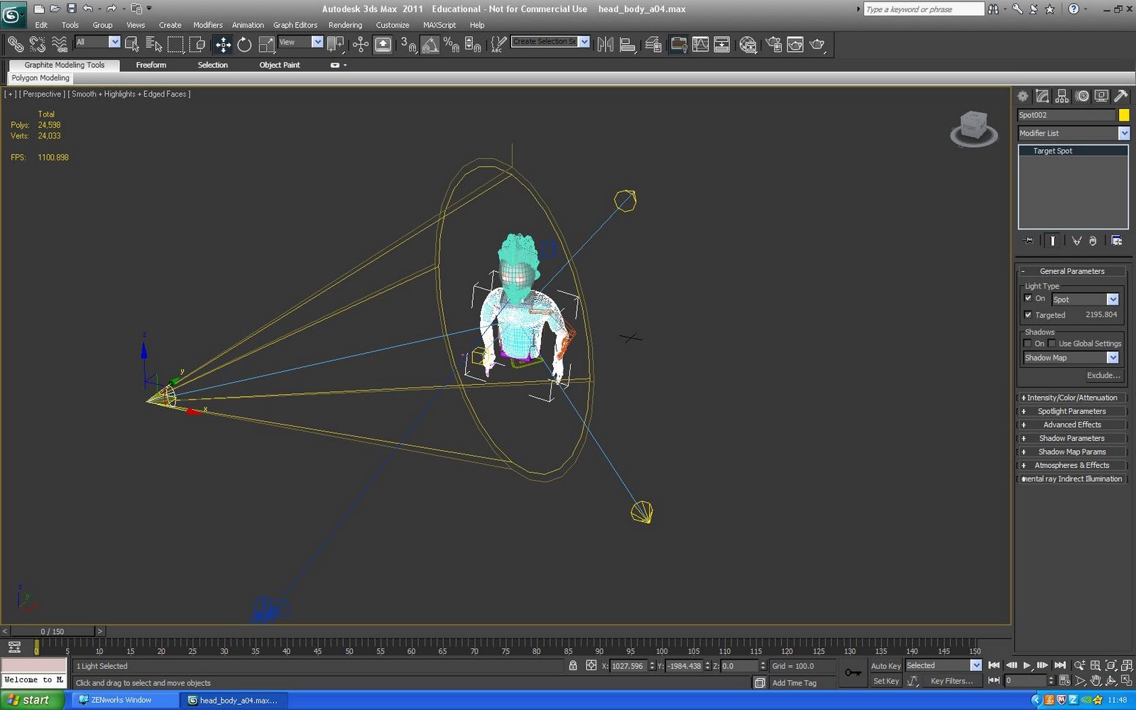
Rigging was especially important as the way our character moves has to be accurate. I first placed the bones in the mesh in the appropriate positions that the mesh would rig the best. I based the hand bones on my research of bones creating carpals and phalanges. I felt this would best create the most realistic kind of outcome. I used the skin modifier and altered the weight of vertices to best create the skin affect on the hand. It is important to keep fall off even between joints so that the skin pulls over the knuckle and creases at joints as real skin would. I added an extra bone at the palm of the hand so that I created create the impression of the palm muscle as researched in my research project. The great advantage of a cat rig is that you can customise it by adding bones to best fit your mesh. This helped in both the bone in the palm and also in the forearm. I split the forearm into 3 bones so that when the wrist turns it gradually turns the forearm as oppose to having one bone which turns right up to the elbow and looks un-natural. I also evenly distributed weight up the torso so that the body would bend naturally in all directions. Finally I added a ‘gizmo’ at the joints of the hinge bones so that vertices did not overlap each other when bending together. This creates accurate elbow joint and finger joints.


Project Implementation Animating / Rendering

When beginning to animate I had to compensate in some areas for the rigging of the character as it did not look completely natural under the armpit regions of the model. This was apparent mainly in the ‘Cat’ render.  After tweaking around with the positioning of the arms and rigging of the model I managed to disguise some of the creases leaving it look more natural. I used video reference of myself based on what I researched on sign language. I then used this to animate my character. I am very happy with the fingers of the hand as they represent the signs accurately and move smoothly and naturally. I aim to combine several renders into each video so that children can see the Sign from different angles. Close ups and long shots.

Here are some test Renders without Lighting


After effects
I created a max script of the movement of the real life camera using synth eyes and then imported the script into 3DS max. I then set up the proxy model infront of the camera using the camera and real footage as a basis for the scene. This helped me angle the camera at the character so that it will look as if it was actually within the scene. 

I rendered my character footage using .tga files. I rendered once through to get a reflective pass which acts with a proxy model of a laptop and then another time without the lap top and just the character with the rest of the passes. Alpha, Diffuse, Lighting, Matte, Self Illumination and specular passes. I then import these .tga sequences into After Effects and then over laid them onto my real time video footage. Then it was a case of blending the multi passes using blending modes using the rule that any pass to do with light uses blending mode multiply, any pass to do with reflection uses blending mode add and any pass to do with diffuse uses blending mode normal.

I began using after effects for the compositing side to my project. After Importing in my video footage I imported my .tga sequences.  Then I matched them up and used toold with after effects such as masking and colour correction to make the whole scene look like one.